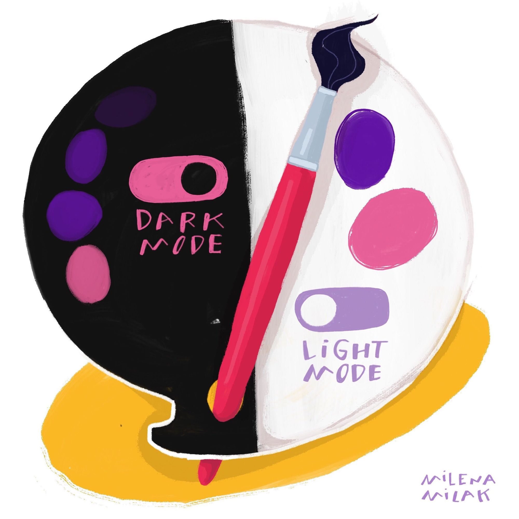
This is a guest post by Milena Milak
I’ve been an artist my whole life, in various forms -- children’s book illustrator, tattoo artist, and maker of branded images and characters. Years of formal training in painting and drawing armed me with the flexibility I needed to deliver across each of these creative pockets, but I was genuinely surprised when it prepared me for another: UI design.
As a more “traditional” artist, UI design seemed like another realm -- one where developers and graphic school grads hung out. As I chased partnerships with picture book publishers and apprenticed with tattoo shops, it had never hit my radar. I was more likely to think about gesso than I was to think about wireframes. Only after the pandemic hit -- and lockdown put a heavy pause only my career as a tattoo artist -- did I begin to see it’s appeal.
I’d been doing illustration work for MagicBell, an embeddable notification system, for about a year. The founder, Hana Mohan, was big on accompanying blogs with original artwork that perpetuated the company’s unique style. But when she started turning her attention to fine tuning the platform’s user interface -- and knew that I had spent some marginal time exploring UI design principles -- she asked me if I wanted to try using my freshly acquired knowledge about on MagicBell’s app.
I had some trepidation. I hadn’t a clue on where to start but said yes on the merit that I had taught myself new skills before. Hana believed I could do it, so I chose to believe that as well. My self-education did not begin romantically, but rather with some basic “how-to” Google searches. A week later, I began my first project: redesign the current UI for MagicBell’s dark mode settings. Aside from providing another visual option for users, it’s also used as an accessibility setting.
By default, I approached this project more as an artist and less as a designer -- and that’s exactly what paved the path to its success. After finding tons of resources on Google’s and Apple’s official guidelines for dark mode apps, I realized that I was at an advantage: the challenge didn’t lie in the technical requirements, it lay in the artistic conceptualizations...the ones I already mastered. To my surprise, I was further ahead in my design career than I had realized.
To the artists considering UI design who are scratching their heads right now: dark mode is a setting that presents a dark (grey) background with lighter text. Google “Dark Mode popularity” and you’ll find some opposing thoughts (it’s becoming the dominant setting in apps...but it’s a fad. It makes things more legible...but actually that’s a myth. Or is it? Who knows.)
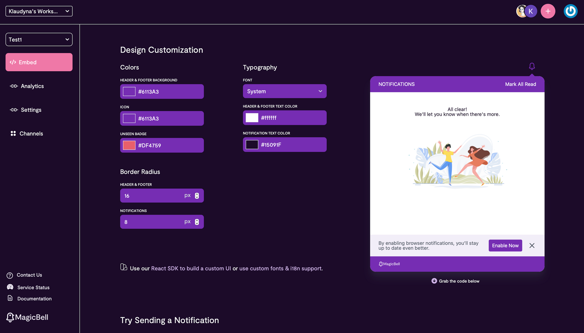
MagicBell’s original dark mode UI
The main complaint about dark mode is that many designers who seek that visual “pop” make the contrast too high, which can tire the eyes. The easy mistake to make, without deeper training in artistic foundations, is to design something that feels clunky, appearing more functional than aesthetic. I felt I could match function with fine art, and so I got to work with tenets of classical painting:
What Artist Already Know About UI Design
Consider the quintessential classical still life -- usually a table of fruit and flowers.
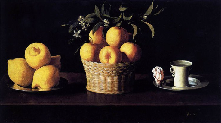
Still Life with Lemons, Oranges, and a Rose by Francisco de Zurbaran, 1633
Here, the artist is using old school dark mode (employing the same shadow techniques I used in MagicBell’s dropdown menu to create perspective -- but I’ll get to that in a minute). In some areas of the painting, he alters the opacity of the colors so that the viewer is overwhelmed by nothing else but stark contrast.
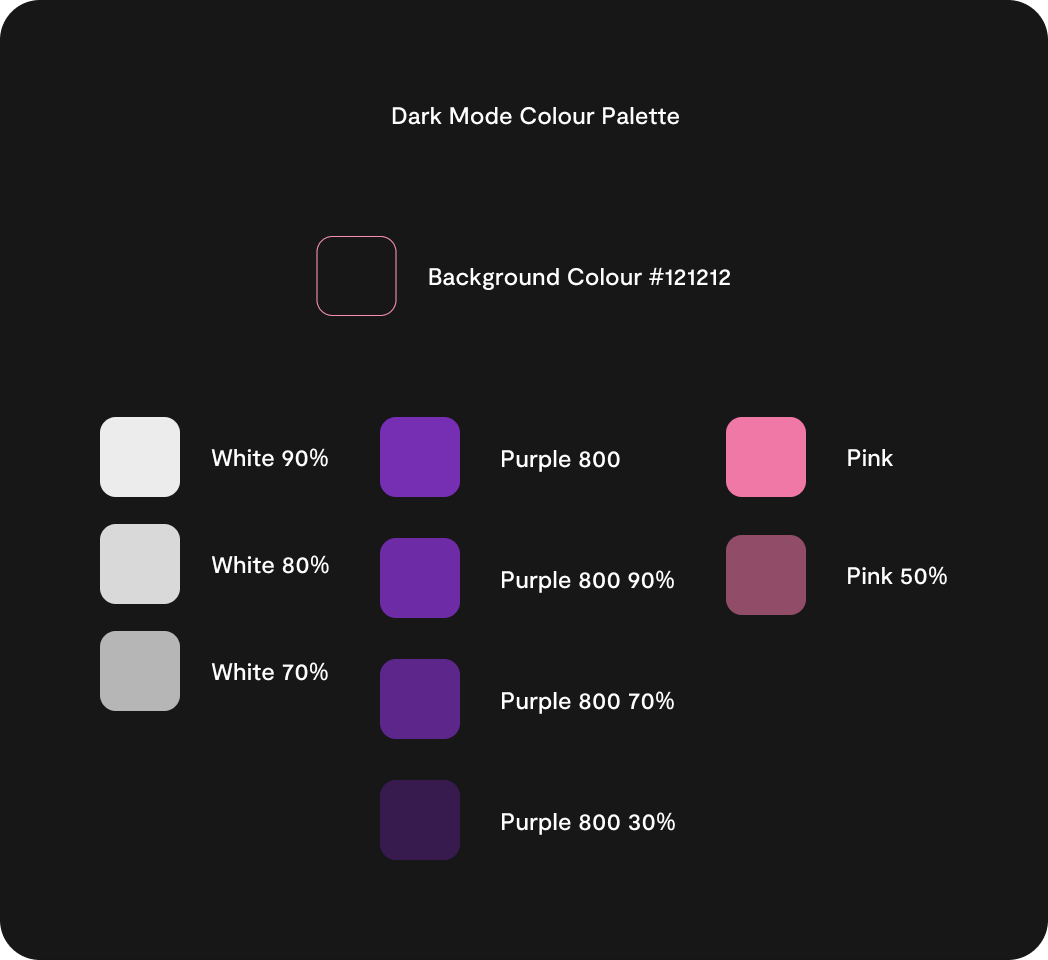
I applied this concept to varying opacities for the fonts. While I had a pre-selected color palette, I could use the same principles that artists do with watercolors: thick, undiluted color paired with more watered-down, easier-on-the-eyes pigment that still offers a sense of vividness against the darkness. (In this case, I set the purple brand color at 80% opacity, which was both contrasting but soft against the dark grey background.)
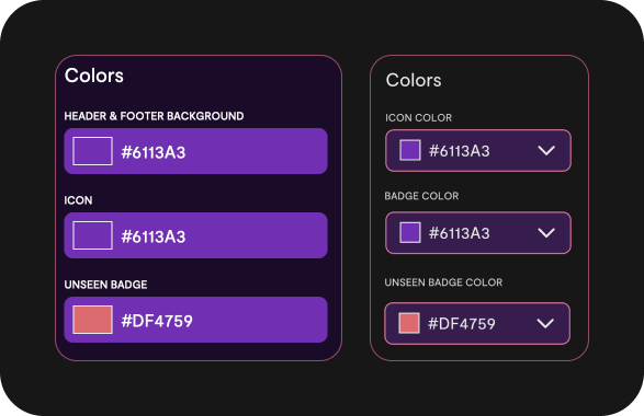
As I continue to learn more about bringing these two worlds together, I see the non-artist’s temptation in opting for intense, contrasting colors in dark mode.
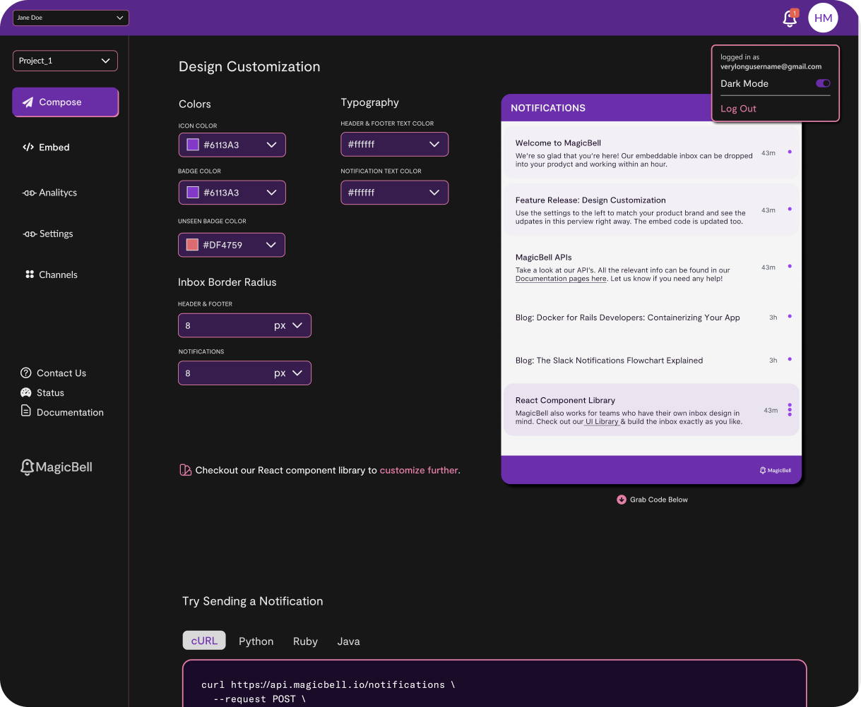
Here, I'm using transparent colors to dim the contrast in the fonts, dropdown menus, and top navigation menu, and I added a pink stroke to make it look more attractive. I also added shadow around the menu, a decision based directly on my painting experience -- it achieves the illusion of perspective. Why is that important in UI? Because an artist’s choices around light, color, and perspective direct the user’s attention and tell us what holds priority over other items demanding eyeball real estate. Yes, even on our apps, color and light dictate the simplicity (or complexity) of our navigation within them.
The decisions I made about MagicBell’s dark mode settings were decisions I would have made had I been painting it. For example, when users open the dropdown menu in the top corner, I use shadowing to transform it from a flat object to one that looks closer to them. It’s subtle, but that subtly gives the 3D illusion of perspective.
How Artists Can Start Their UI Design Career
An artist starting out in UI design will immediately apply the core principles they’ve used many times before: how composition works, light and dark spaces, color theory, layering colors, perspective, and other frameworks of fine art.
While formal training always helps, the internet has everything one needs for self-teaching UI design (and I’m living proof). Online, I’m seeing a growing community of artists now exploring UI design -- likely a shift caused by the need for remote work in the pandemic.
Get your feet (and digital paintbrush) wet by watching some YouTube tutorials. My favorites were DevEd, Figma, and Laith Wallace.
Interaction Design is a great platform of online courses focused on UX and UI exclusively. It requires an upfront annual subscription to access ($200), but their certificates are widely recognized in the industry.
Laws of UX offers visual and interactive representation of UX and UI principles, and can help new-to-UI designers learn about best practices.
Get very comfortable with Apple and Google’s guidelines for UI design, which you can get via materialdesign.io. This was my main source of research as a true beginner (it’s where I learned the foundations of dark mode).
TopTal is another great DIY resource, and a one-stop shop for gig opportunities to try out your new skillset.
I’ve also learned a lot from Reddit! The UI subreddit has an involved community that’s always happy to share feedback (and point out mistakes).
Aside from ease of access to learning and the advantage of already possessing experience, artists-turning-UI designers will experience another perk: their very own renaissance.
Since taking the leap into this new skillset, I have rediscovered the excitement that drove me to be an artist. I feel driven to learn more, feel pride in applying what I learn, and satisfaction in knowing thousands of people are interacting with what I am creating.
As I grow my UI skills as the MagicBell design intern, I plan to extend into UX and, eventually, expertly bring together the artistic and the functional -- without having to sacrifice either. I entered this shift with trepidation and I am coming out the other side with a sustained and promising curiosity. To artists looking for a career change that doesn’t stray too far from the heart, I vouch for UI design!
