Email notifications can be tricky to get right. Without a purposeful message and design, on the email scale of valuable to spam, they’ll slide closer to spam. But a successful strategy needs to go beyond exceptional copywriting and design.
User settings for both inboxes and whole devices are changing, potentially affecting the way people see your emails. There are nuanced elements of email architecture that happen at the development stage, and utilizing these aspects can help ensure your message is seen.
Newsletters and marketing campaigns get a lot of attention in the world of email design, but a well-designed email notification is just as important. Meaningful email notification design combined with short, worthwhile messaging will engage users by giving them the information they need—and quickly. Besides new email trends, also consider the wider world of general design trends when planning a new email notification design strategy.
Find your essential elements
Successful email design might differ from one organization to the next. However, there are a few key design elements that email notifications should have, along with a few foundational elements that should exist in the email’s code. Whether emails are custom built by developers or you’re using an email delivery and templating service, there are certain things that should be added to the code or entered into a template.
Succinct Messaging and Personalization
We’re combining these two since email notifications should be short by design. There are a few messaging elements to get right: the subject line, the preview text after the subject line (also called the preheader, which we’ll break down in the code section), and the actual message inside the notification email.
A user should know exactly what the email is about without opening it. This is the job of the subject line and the preview text that follows. Personalization is easily tied into this by including the user’s name, if that data is available, or saying precisely why the email notification was triggered. A very basic example of a triggered email notification is a password reset.
Most of the time, these emails don’t get opened because the subject line and preview text tell the user all they need to know. Providing your user with the information immediately in the subject and preview text is great, but when they open your notification, you want to provide an equally great experience.
Brand Identity
The first design hiccup to overcome is tying short email notifications to your brand. It should go without saying, but short emails should maintain the same tone of voice users are already used to with your website, app, or longer-form emails like newsletters. Please don’t let your developers write your transactional notification emails—utilize those wonderful copywriters!
Two mainstays of visual brand identity are colors and fonts. And even something as simple as these elements can pose problems in email design. Unless your brand is dependent on one of the ten-ish standard web-safe fonts (like Arial or Helvetica), your messaging typed out in your custom web font might not even make it to your user’s inbox.
Gmail is the culprit here, and as we all know, Gmail is huge. Having previously supported no web fonts at all, it now supports just two: Open Sans and Roboto. This means that if your customer is using Gmail, your custom font will always be delivered as the fallback web-safe font in the email code—if your developer or email person has remembered to set one up. See the full list of email clients that support web fonts.
Good code
Whether you’ve got developers custom coding emails or you’re using some kind of templating service, the quality of the code behind the email matters. An often forgotten element of emails is the preheader message. The preheader is the little description seen after the email’s subject. This description will auto-generate by reading the first line of text in your email. But depending on the message, this might not be the best way to get the information to the recipient. If the first thing in your email is a photo, your preheader might end up as the alt-text of your image—also not great.
Why is this a development issue and not a design issue? Because developers can be sneaky and create invisible preheader elements. This means your design can be whatever you want, and the preheader message can be customized to catch your user’s attention.
There’s a lot that goes into the code behind a well-rendered, well-received email, and we can’t touch on all of it here. We didn’t even get to the special case that is Outlook email rendering (we’ll let ContactMonkey handle that one for now).
Now that we’ve gone over some essentials for good email notification design, let’s take a look at one.
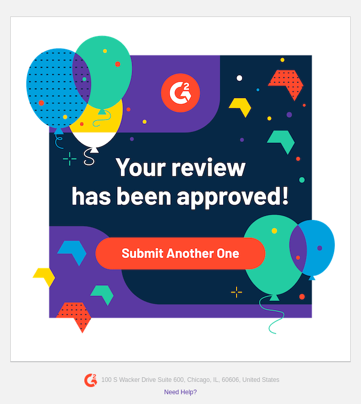
Image Source: Really Good Emails
This short, on-brand email notification gets right to the point. Before the email is even opened, the subject line of the email reads: “Approved: Your G2 Review of 1Password” (as seen on this report from Really Good Emails). The user doesn’t even need to open the email to know what it’s about or why they’ve received it. But if they do open it, they’re getting a very on-brand experience. If we look at G2’s website, we can see the email notification design was directly inspired by the design, colors, and fonts used on the site.
Users have more choice, so design needs to keep up
Technology is expanding to give users more options on how they view content, including emails, which can be bad news for design. But if emerging trends are embraced in the design process, this can be a boon to long-term success.
Mobile
It might seem like a no-brainer, but the archaic way emails need to be coded means they might not be as responsive as you think they are (hint: Outlook). Without a thoroughly tested responsive design, you might end up with something that overflows on the X-axis when viewed on smaller sizes. Your users might have to horizontal-scroll to read all your content, and that’s just no fun. Mobile devices present some other weird quirks as well, like not rendering the actual font size and using a text inflation algorithm to render font size instead. This means that the precise font size designers choose might go out the window upon mobile rendering.
The terms “edge-to-edge” or “full-bleed” might be thrown around in email design, meaning some asset—or the whole email—needs to span the entire width of the device, leaving no border or negative space on the sides. On mobile, this idea makes a lot of sense. The screen is already smaller, so you want to use all the space available to create beautiful email notification designs. Whether or not you’re custom building emails or using a templating service from a communication provider, full-bleed is not standard, and some work usually needs to be done in the code to achieve this effect.
Since there are so many mobile devices and mobile operating systems out there, take extra care to test your email notification designs across a variety of desktop and mobile clients. Our free HTML email checker lets you preview how Gmail sanitizes your HTML email templates before you send. For comprehensive cross-client testing, services like Email on Acid and Litmus can also help.
Dark Mode
Dark mode is not a new concept, but the way dark mode settings affect emails can be interesting. Tech-savvy early adopters, developers, and those who read emails at night are some of the users who are more inclined to have dark mode turned on.
An essential part of preparing emails to send is keeping them lightweight, so they render quickly (and don’t get marked as spam). As such, JPEGs are usually the go-to format for images, but any JPEG that has a white background can end up looking very off in dark mode.
This example from Email on Acid’s article on testing for dark mode shows what happens when images with white backgrounds find themselves in dark mode.
We can only speculate, but it looks like the design used the white border of the photo to create the margins around the image, rather than using code to position the image exactly. A solution to this problem is to crop the image to the content and create margins around the photo—with CSS if it’s a custom-built email or through your email template editor.
Another solution is to ditch JPEGs and switch to PNGs. This creates negative space around your content, so you don’t have to worry about awkward white space in dark mode. This does come at the cost of heavier images, but as long as the image weight isn’t out of control (1MB or less per image), it shouldn’t be a huge issue.
PNGs can still create a little trouble, though. If your logo (or any image-based messaging) is black and you use a PNG for this asset, it might get lost or be completely unreadable in dark mode. This is definitely a conundrum, for which there is not a great solution. This is a task for your designers to handle 😉.
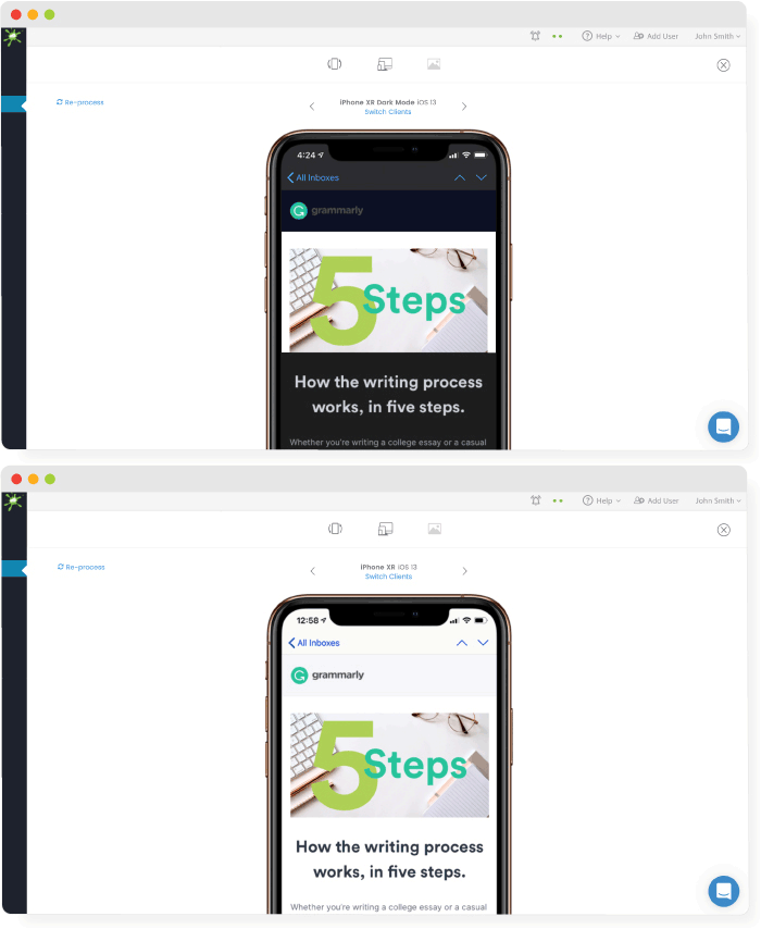
Image source: Email on Acid
Email notification design trends for the future
When we discuss email design trends, the focus is usually on creating great newsletters or engaging marketing campaigns, but email notifications like a subscriber billing cycle or a password reset represent your business and product as much as any other longer-form email. If you’re changing up the style of your newsletter, carry over those great new designs to your email notifications as well!
Boldly use brand colors
In the email notification design example above from G2, we can see how they’re boldly carrying over the color palette from their website in a fun, adventurous way. Their notification could have simply been a quick line of plain text with a basic call to action link, but they’ve clearly taken the time to use their brand’s colors to enhance the notification email into something fun.
Maximalism
In the same vein as boldly using your brand colors is maximalism. We’ve been on a minimalism trend for a while, so now might be the time to experiment with big, bold designs, patterns, and loud fonts. This type of design takes a lot of finesse, though, as you don’t want to go so far as to annoy your users.
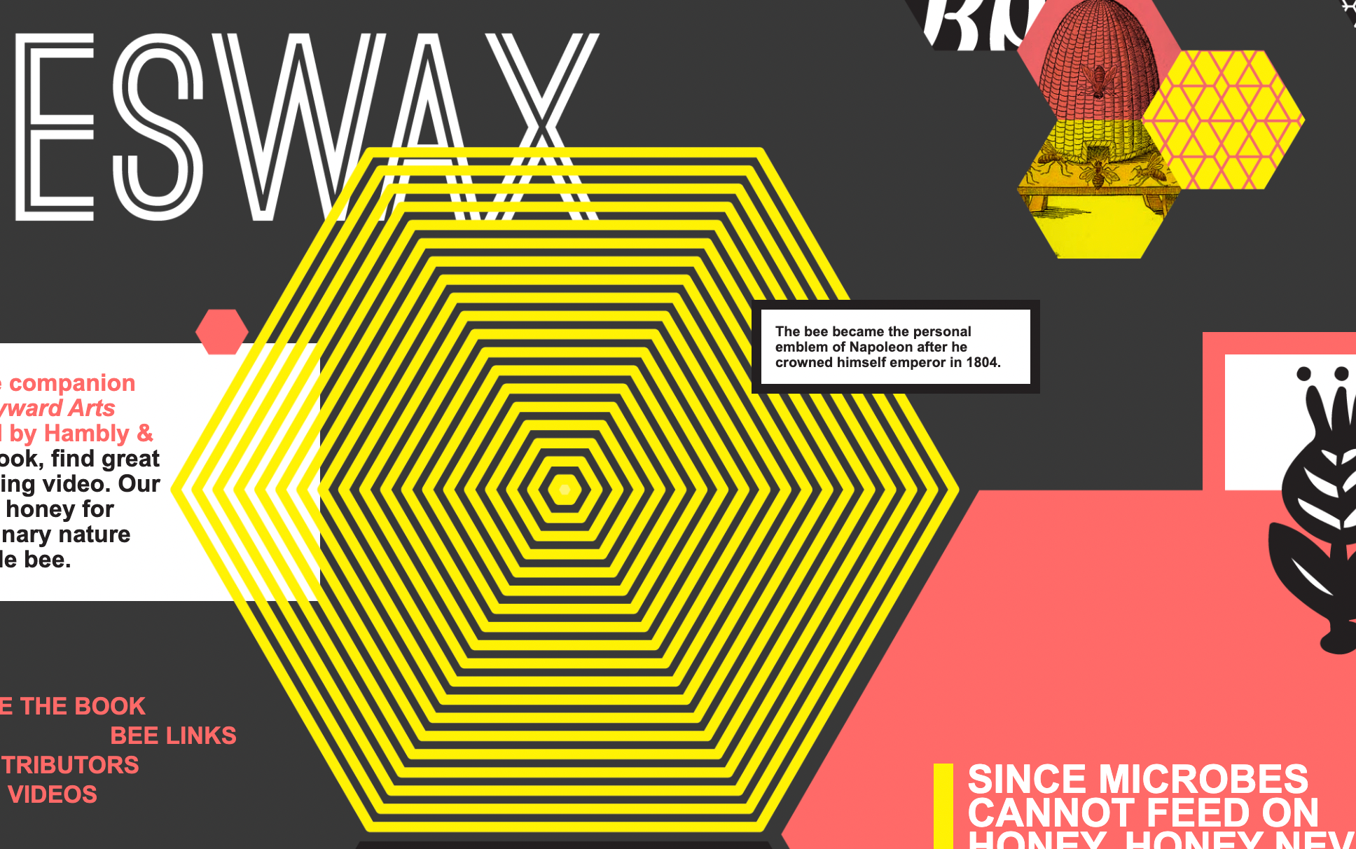
Hambly & Woolley’s educational page about bees utilizes a maximalist design with bold colors, patterns, and different font styles and sizes. Even though there’s a lot going on, all the individual pieces of the design relate back to one another in some way, whether it’s shared colors or shapes. Bringing a bold, cohesive design into something as (typically) short as an email notification can be a fun challenge for designers.
Screen capture from Hambly & Woolley
More dark mode
The example above from Hambly & Woolley shows how using a dark background color can be effective and can enhance certain aspects of design. In their example, the inspiration is clearly coming from the colors and patterns most associated with bees.
Since we’ve already touched on dark mode, we won’t go through it all again here, other than to say if it’s gaining popularity with a variety of users, why not embrace it? Consider using black as the default background color for your notifications.
This email notification design from PremiumBeat feels more like a campaign design—it’s very curated. They’re carrying over the darker theme from their website into their notification email, as well as providing an on-brand image to make it fun to look at. This creates a specific on-brand atmosphere for their user—all to confirm their email.
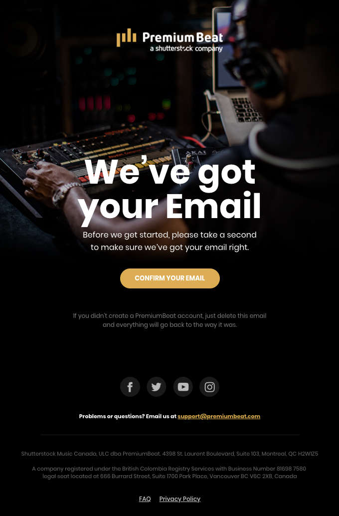
Image source: Really Good Emails
Let MagicBell handle your workflow notifications so you can focus on your brand
Email notifications for your workflow can be distracting or may be overlooked in your inbox. MagicBell is an in-app workflow notification system that you can customize to match the look and feel of your brand.
Let MagicBell handle your workflow notification system while you get back to designing and developing. Try out a free account today.
