UX accessibility: an aspect of design that mostly takes a backseat. The thing is, design and accessibility can and should live harmoniously. Your design process may be slightly longer, but your users will thank you.
Legally, the issue of online accessibility is murky. While laws exist for physical spaces, digital spaces operate by standards. Standards are not laws, and companies are not required to implement them. However, lawsuits are on the rise, and the courts often find for the plaintiff.
The best businesses can do is follow standards known to create accessible experiences, but building accessible websites and apps should not be about avoiding lawsuits. It should be about wanting to create the best experience for all your users.
Before you design: UX accessibility considerations for notifications
Break down the elements of your notifications and find the challenges ahead of time; this will eliminate the backtracking required when you design first and account for accessibility last.
Notifications require the same considerations as any other feature, plus additional considerations because they can have simple and complex content. Creating an accessible notification experience starts with knowing what elements need careful attention.
Determine which elements need to go into a notification design and implementation:
- Colors need to be contrasted for those with vision impairment.
- Fonts need to be clear and remain readable against their background.
- Images, GIFs, and videos need alternative text (alt text) to provide context if the media fails to load.
- Videos should include subtitles.
- Animations need to be subtle and avoid certain patterns to avoid triggering nausea, headaches, and seizures.
- Surveys and forms need to be to be properly labeled with things like button options and form fields.
- Surveys and forms also need to have clear focus states for keyboard users.
Also consider the amount of time a notification remains on screen. Some users need more time to read or to navigate (via keyboard) to the notification.
All these things need UX accessibility attention. While it can seem initially overwhelming, learning how to build out an accessible notification or notification system can create interesting and useful learning opportunities.
Use tools and resources to aide accessible design
There’s a lot to keep track of when it comes to accessibility; the great news is there are plenty of tools and guidelines for designers and developers. These tools and resources can be used to verify not only the UX accessibility of notifications, but also all the parts and features of a web app.
Tools and resources for the design and development process
- Contrast Mac App: A cheap ($6.99) application that works alongside your design tools to help you design features with proper color contrast. This app checks Web Content Accessibility Guideline (WCAG) contrast scores.
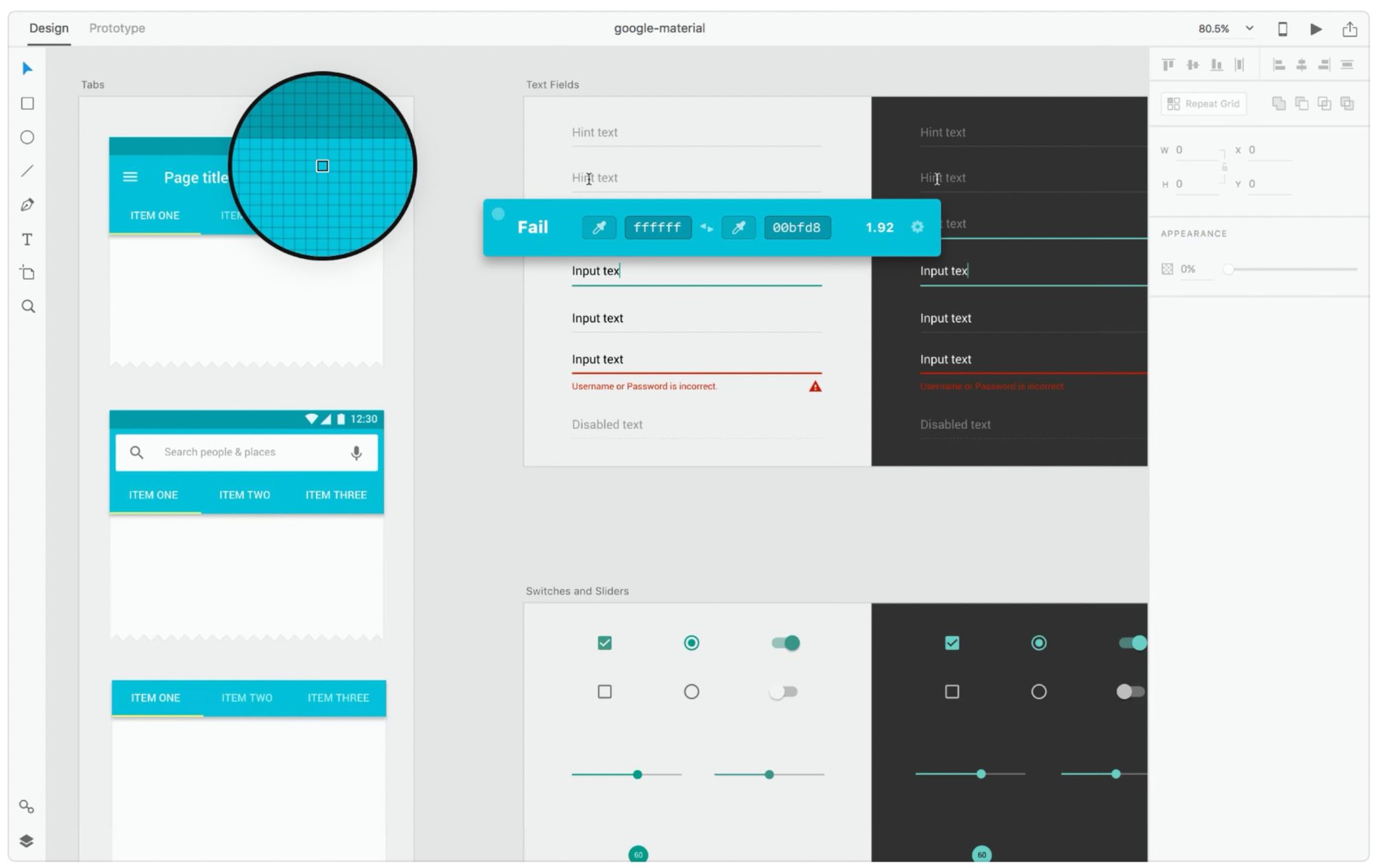
Image source: Contrast Mac App
- Web Accessibility in Mind: Typefaces and Fonts: A document for learning about typeface readability for those with visual impairments. This includes thoughtful design tips for font weights, spacing (kerning), and contrast.

Image source: WebAIM
- Choosing the Right Font and Its Presentation: A Key to ADA Accessible Websites: A presentation that discusses what makes fonts accessible. This resource goes over font spacing, alignment, color, and user-controlled sizing (pixels vs. points vs. ems vs. rems).
- Convert Pixels to Rems Automatically: A well-written blog post that breaks down how to design and develop copy responsively. Designers and developers can work together to make sure the size of copy in the final product is as close to the design intention as possible by converting pixels to responsive units, like rems.
- PEAT (Photosensitive Epilepsy Analysis Tool): A tool to check whether animations and other content could potentially cause nausea or trigger seizures. Checking for these problematic animations is complex, and PEAT is a leading tool for this purpose. It is currently Windows only (or with a virtual machine on a Mac). There is a variety of reading available on this topic, as listed below.
- Three Flashes or Below Threshold: A fairly dense explanation of how to keep animations and content compliant by checking whether or not there are flashes happening more than three times in one second.
- Accessible Web Animation: The WCAG on Animation Explained: A guide to implementing CSS animations that are compliant with WCAG guidelines.
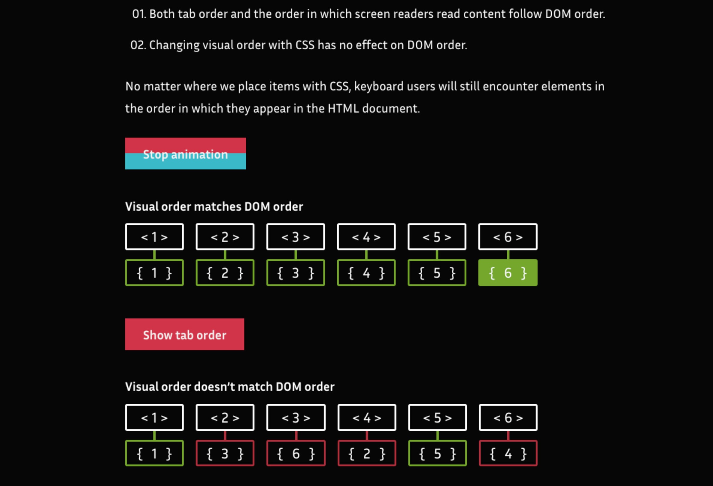
Image source: CSS-Tricks
- A Guide to Creating Accessible Animations: A guide to design and development considerations, like parallax, sliders, and carousels.
- Aria Labels: Aria labels describe the role an HTML element has. They are crucial for those who use a keyboard or screen reader to navigate a website. Roles are needed for elements like alerts, buttons, and checkboxes, among others.
Browser Extensions
- Color Contrast Checker Chrome Extension: A Chrome extension that checks the color contrast of a website to see where improvements are needed.
- Screen Reader Chrome Extension: A Chrome extension that lets you navigate a website (or feature) with your keyboard to get a feel for the experience keyboard users have. This allows you to check to make sure the elements can be navigated in the proper order.
Tools and resources before it goes live (or to quality assurance)
- a11y Checklist: A comprehensive checklist for WCAG compliance. This checklist not only provides guidance, but is also a source of learning about each element on the checklist.
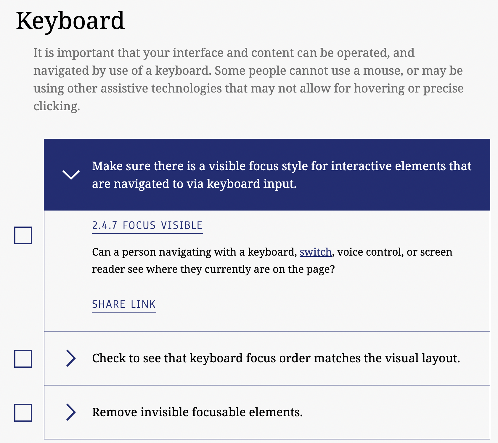
Image source: a11y checklist
- WAVE (Web Accessibility Evaluation Tool): Check an url to get an evaluation of how well the website is set up for UX accessibility. See where images are missing alt tags or aria labels; check for low contrast.
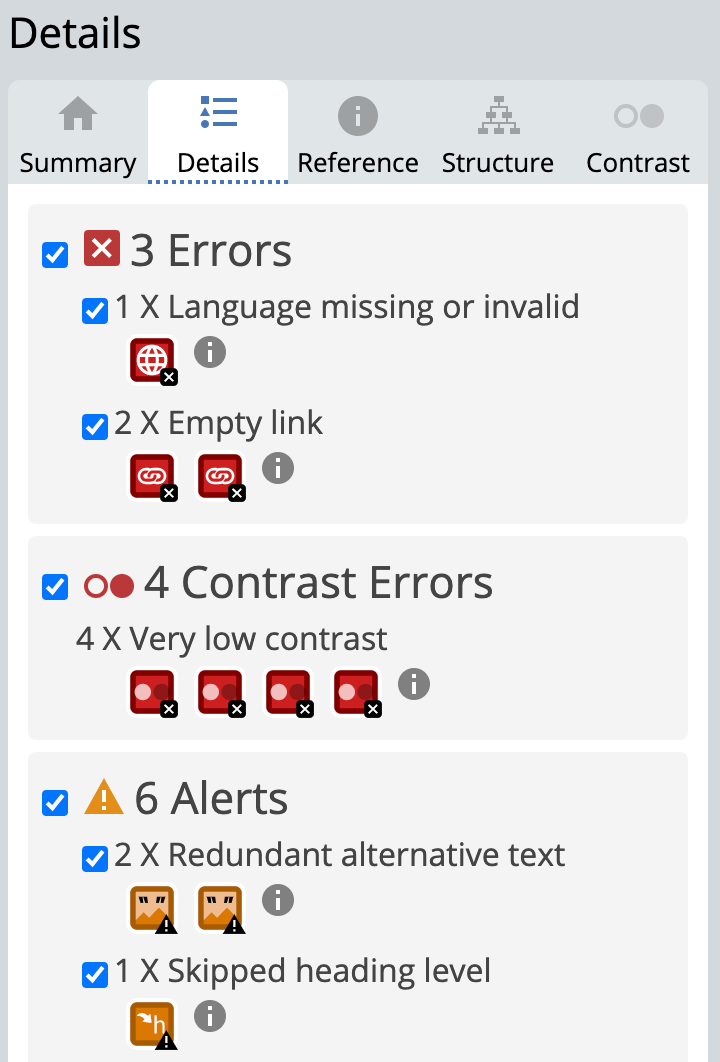
Image source: WAVE
Include UX accessibility in quality assurance
Companies generally do QA (quality assurance) in one of two ways: there’s a whole QA team that focuses just on this, or the job falls to designers and developers to check their work before a feature release. Either way, the people who do QA need to know how to build UX accessibility checks into their workflow.
Perhaps basic, but remember — test your feature(s) on:
- multiple devices
- as many screen sizes as possible
- as many browsers as possible (including Internet Explorer)
Internet Explorer is still supported, for now. A lot of industries still rely on Internet Explorer because of legacy applications and code, so it’s important to make sure Internet Explorer users have a valid UX accessibility experience. This is especially true for notifications, which might need a custom solution to function on Internet Explorer.
Navigation
Make sure elements retain their focus state everywhere. Since in-app notifications can be complex and allow you to include surveys and forms, these will require special QA attention. Forms often require users to:
- select checkboxes
- select radio buttons
- type in form fields
Keyboard users need to be able to navigate and select within these elements. Check whether or not a notification has a proper tab order as soon as it appears. Confirm users can navigate with arrow keys and make selections with the spacebar.
Readability
Check that the amount of time a notification displays on screen before disappearing (and hopefully going into an inbox for a user to check later) is long enough to fully read and for keyboard users to navigate to.
If the notification contains media, like images, you’ll also need to check that the alt text also can be read by a screen reader. You’ll also need to simulate content failing to load in order to check that the alt text is displayed in a way that is easy to see. This way, the context of the missing content won’t be lost.
Color
In addition to making sure your colors are contrasted enough in the design process, browsers have different color management and will render color saturation differently. Check your frequently visited websites on Firefox. You’ll likely notice that colors are very saturated on Firefox compared to Chrome or Safari. You’ll want to consider this in the design process to avoid color issues that might not arise until QA.
Fonts
Depending on the webkit being used, devices can render font size differently than expected. If you’re only checking your feature on one particular device or on one particular browser, you might not be aware of this. Plenty of people discover this issue when doing QA or viewing a released feature with a different method.
Take control of your notifications’ UX with MagicBell
Notifications should have an inbox where users can find, read, and respond to them. This allows all users to come back to your messaging and interact with it when it’s convenient for them. MagicBell provides that inbox and is completely customizable through our SDK.
Designers can have complete control. Include fonts, colors, and media accessible for everyone. Design a sidebar inbox, or create a fully separate page for notifications. Developers can remain in control of tab order and implement a UX accessibility friendly experience with elements that have Aria labels and alt text.
To find out how to give your users a great notification experience, schedule a demo today.
